Bossa, a simple yet stylish game for two: Episode 12
Written by Hiroshi Maeda, Bossa team leader
:::
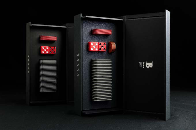
CLASSIC-neo edition (releasing in 2023) and CLASSIC edition (released in 2022) are versions of Bossa that feature a natural look and feel. Although each has its own characteristics, they are like siblings with a common concept. Today, I would like to share with you in detail our thoughts on CLASSIC-neo/CLASSIC and our choice of materials.
:::
:::
At first, let me briefly introduce the difference between CLASSIC-neo and CLASSIC. CLASSIC-neo is new this year and is based on CLASSIC, which was released in 2022, with a design inspired by snowy landscapes. One additional layer has been added to the dot tiles, creating a three-layer structure. The box material has also been changed to one that sparkles. And two modifiers, expansion components, have been added. Other than that, CLASSIC-neo and CLASSIC are the same.
:::
The original concept
The concept of “hare” and “ke” is alive and well in our Japanese life. The word “hare” means “extraordinary” in the sense of the word. For example, clothes worn on special occasions such as weddings and graduation ceremonies are called “hare-gi,” and their stages are called “hare no butai”. So, Bossa’s THE ART edition may be “Bossa for hare”.
On the other hand, “ke” represents “everyday” things. Traditionally in Japan, living close to nature in the four seasons and being simple and modest have been the virtues of “ke”. We wanted to have a Bossa at hand that would enrich our daily lives, that would be simple and modest but of high quality, and made of natural materials as much as possible. Yes, the concept of the CLASSIC series is to make “ke” even more pleasant.
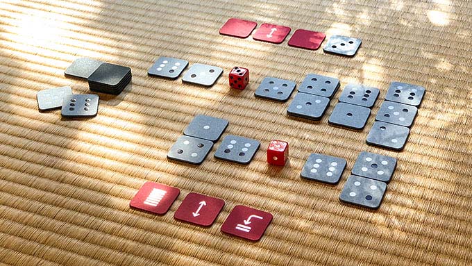
Imagine, for example, leaves swaying in the wind, light and shadows falling through the windows, and we are playing Bossa. Wouldn't that be a lovely time?
:::
Leaves are swaying in the breeze, casting light and shadow on the Bossa CLASSIC.
:::
Paper tiles with a gentle touch
The CLASSIC series dot tiles feel very gentle to the touch. There are two reasons for this.
One is the use of dyed paper, which has a natural texture and smooth feel. The other is that the surface of the paper is neither “printed” nor "coated" with a base color. The color of both the face side and the back side of the tile is the color of the paper itself, dyed. Because there is no layer of ink or coating on the surface, the original texture of the paper can be directly touched.
The foil stamped and additional lightly debossed dots are slightly indented, which is also pleasant to the touch.
From the face or back, CLASSIC-neo and CLASSIC dot tiles are identical. It is because they share the same materials.
:::
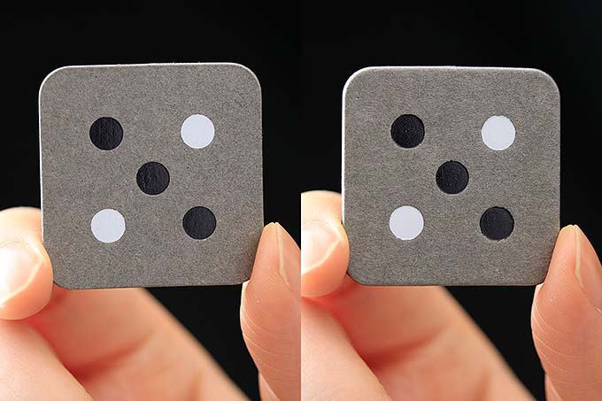
Face side of CLASSIC-neo (left) and CLASSIC (right) dot tiles, same material, same appearance
:::
Cross sections with different expressions
The difference between CLASSIC-neo and CLASSIC dot tiles is well shown in the cross section.
Looking at the cross section of a CLASSIC edition tile, you will notice that there is no card board or chipboard core as in typical paper tiles or chips. It is a two-layer structure consisting of a thick gray paper on the face side and a thick black paper on the back side (technically, there are two sheets of each color, so four layers in total). They are dyed papers, so even the cross section shows beautiful colors. And the very simple beauty is what makes CLASSIC unique.
:::
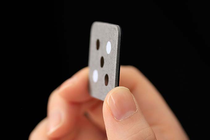
2-layer CLASSIC dot tile
:::
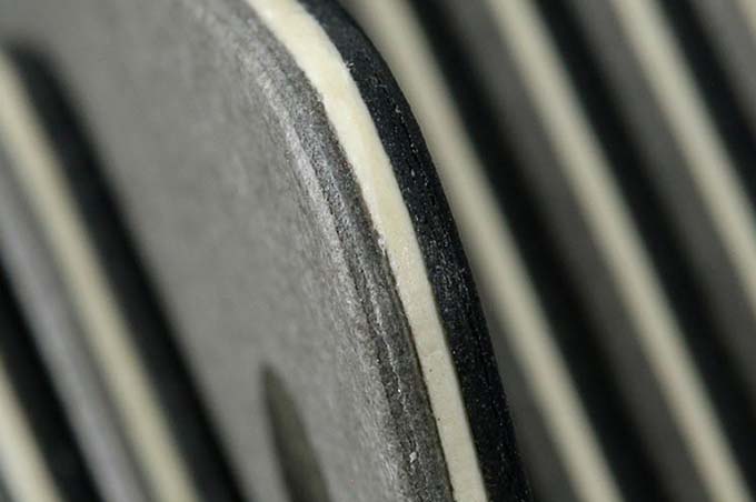
CLASSIC-neo dot tiles have another layer in the center, making it a three-layer structure (strictly speaking, there are two sheets of gray paper on the front, two sheets of black on the back, and one sheet of white in the center, so five layers in total). By arranging the thickness of the paper used, the overall thickness (and weight) is adjusted to be almost the same as CLASSIC.
The white paper in the center is not pure white, but a slightly warmer white, which is a good accent when sandwiched between the gray and black. It also reflects the visual design intent described below.
:::
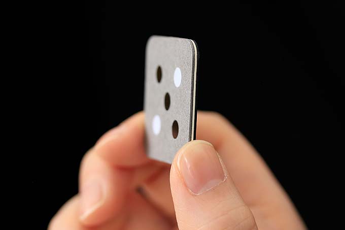
3-layer CLASSIC-neo dot tile
:::
Handcrafted by Japanese artisans
The dot tiles in Bossa CLASSIC-neo/CLASSIC are handmade, one by one, by a skilled Japanese artisan company. Let us show you the proof. Please take a look at the photo below. You can see that the angle between the surface and the cross section of the tile is not sharp not only on the face side but also on the back side. In general machine production, the face side is rounded and the back side is sharp. Naturally, artisan-made tiles have a gentler feel to the touch.
*CLASSIC-neo/CLASSIC edition tiles are handmade at Shichisei Sangyo, a paper craft artisan company in Sapporo, Japan.
:::
Enlarged image of CLASSIC-neo dot tiles
:::
Tiles that “breathe” with natural materials
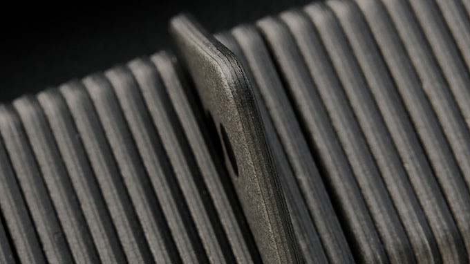
Made of natural materials and uncoated to feel natural to the touch, CLASSIC-neo/CLASSIC edition tiles seem to “breathe” air just like we do. If you look closely, you may notice slight warping depending on conditions such as temperature and humidity. For example, can you see it in the photo below? It is so slight that you may not notice it, and it is not enough to interfere with your game. We are pleased if you understand that this is also a proof of natural materials.
:::
CLASSIC edition tiles cross section close-up
:::
The retractable box is made of paper, surprisingly elaborate
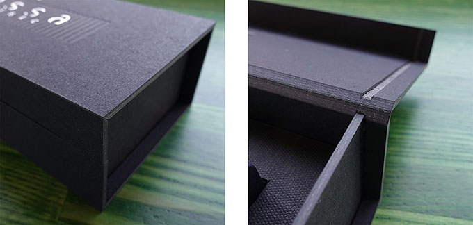
The CLASSIC edition box is retractable. It opens smoothly, closes pleasantly with a natural feeling, and holds. However, this paper box uses no metal fittings or plastic parts. This was made possible by the elaborate paper processing technology of a Japanese box specialist. The “V-cut” technique, in which a V-shaped incision is made during processing, creates precise angles and surfaces to achieve strength and precise interlocking. This is amazing! When I first saw this technique, I was deeply impressed and decided to adopt it for CLASSIC. The same type of box continues to be used in CLASSIC-neo, except for the surface material.
*CLASSIC-neo/CLASSIC edition boxes are manufactured by Morita (https://www.hakop.jp), a company specializing in boxes, in Sapporo, Japan.
:::
CLASSIC edition box close-up. The surface material is different in CLASSIC-neo, but the shape and mechanism are the same.
:::
Townscape on a snowy night
The two editions of Bossa 2023, "yuki" and CLASSIC-neo, were inspired by "snowy landscapes" (for details, see Episode 8 and Episode 9).
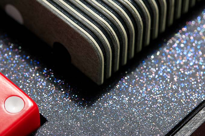
For CLASSIC-neo, we designed the atmosphere of a town on a snowy night. When you open the box, you will find houses or buildings (tiles) half buried in the black but sparkling night snow (inside the box). The stripes they show are like the warm light from the windows. It is a "microcosm" symbolizing the warmth and tenderness of family and people.
:::
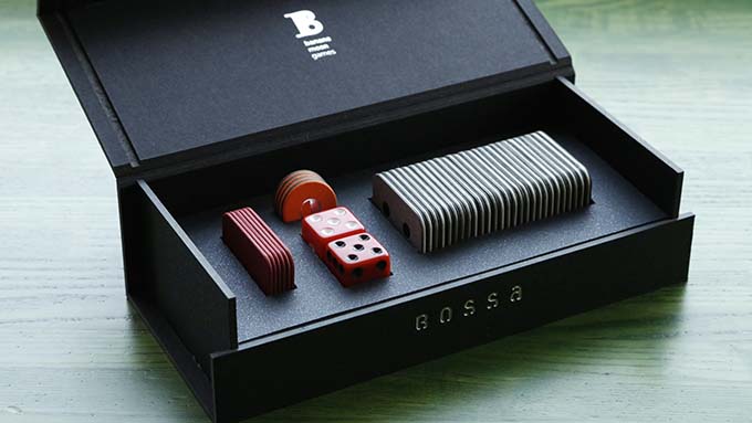
CLASSIC-neo packaging, close-up
:::
Action Markers and Modifier Chips
CLASSIC-neo/CLASSIC action markers are made of red dyed paper with silver-color foil stamped icons, handcrafted by artisans. They are thinned to make them easily distinguishable from the dot tiles.
:::
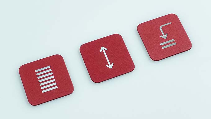
CLASSIC-neo/CLASSIC action markers
:::
Modifier chips, a new feature in 2023, are two layers of dyed paper, orange on the front and charcoal gray on the back, foil stamped in silver-color.
*CLASSIC edition does not include Modifier chips. General-purpose chips, coins or the “2023 Update Kit (Bossa Expansion Kit)” may be used.
:::
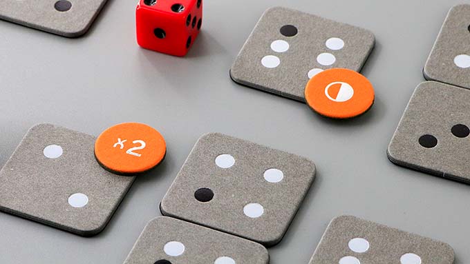
Two modifiers, "Doubler" and "Inverter" (prototypes, on CLASSIC dot tiles)
:::
Environmentally conscious material selection
We want to use natural, safe, and environmentally friendly materials whenever possible in the products we use on a daily basis. Therefore, we prioritize recycled paper blended, ECF (Elemental Chlorine Free) pulp blended, and FSC (Forest Stewardship Council) certified paper in our paper selection. We use a “minimum” amount of adhesives made from petroleum-derived raw materials to ensure the bonding strength of the paper used for tiles and boxes, but we do not use petroleum solvents in the manufacturing process. Of course, we use only materials whose safety has been verified and approved by Japanese laws and regulations. The entire retractable box is made of paper, and no metal or plastic parts are used.
It may not be perfect, but we have put the utmost care and effort into this CLASSIC series that we can do for the environment.
:::
:::
Thank you for reading. And thank you again for your support of our project. We hope you will treat the Bossa CLASSIC-neo/CLASSIC edition with care and use it in your daily life. And may it become your favorite.
Hiroshi MAEDA, Team Leader
:::
Bossa new editions
Worldwide shipping is available only through the Official Store.
→ Banana Moon Games Official Online Store
:::
Bossa Stories
- Episode 17: Commentary on the game with Expansion Rules!
- Episode 16: An amazing paper craft artisan: his delicate and artistic handiwork
- Episode 15: Why play again and again and never get bored? (2023 revised)
- Episode 14: Try Bossa online for yourself!
- Episode 13: Going out with Bossa: the advantages of STANDARD edition (2023 revised)
- Episode 12: The new CLASSIC series: Natural look and feel for everyday use
- Episode 11: New Components Coming in 2023!
- Episode 10: THE ART editions in depth: Enrich your play experience with its beauty
- Episode 9: About the Snowy Sparkly Box
- Episode 8: Hokkaido’s “snowy landscape” as a design concept
- Episode 7: Play over and over again, never get bored!
- Episode 6: Going out with Bossa: the advantages of STANDARD edition
- Episode 5: CLASSIC edition in depth: Natural look and feel for everyday use
- Episode 4: THE ART edition tiles durability
- Episode 3: Bossa THE ART edition, boxes are also THE ART!
- Episode 2: THE ART edition “mizu” and “hana” have a different feel!
- Episode 1: About Mr. Tadokoro, an amazing paper craft artisan
:::