:::
Written by Hiroshi Maeda, Bossa team leader
:::
:::
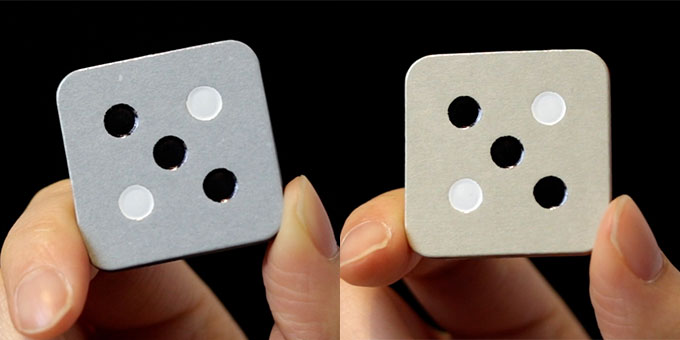
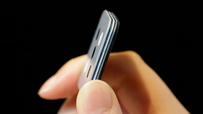
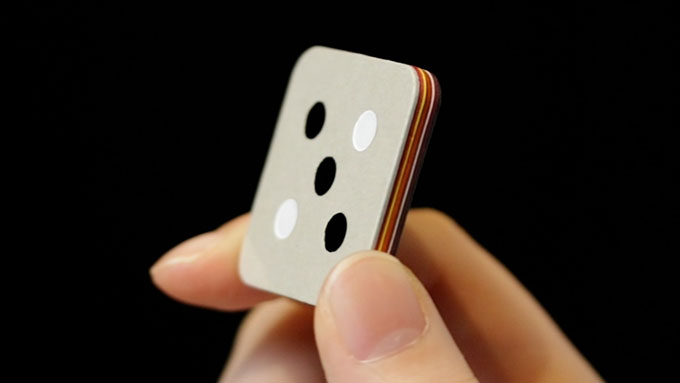
Today, I would like to introduce the difference in the tiles of "mizu" and "hana", which is not only the color. THE ART edition "mizu" and "hana" are both flagship versions of Bossa, and have the same "specifications" as far as their 9-layer construction. However, the playing experience will be different. At least for us, it is, and we enjoy changing the version we use every day, depending on our mood. (Yes, we play it every day without getting bored.)
:::
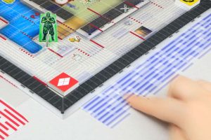
The difference between "mizu" and "hana" is easily recognizable at a glance: the color. But the most noticeable difference in the actual playing experience is probably the "feel" of the tiles when you hold them in your hands. You feel it when you draw tiles from the Pile, when you place tiles on the color line, and many players unconsciously stroke the tiles while contemplating their tactics.
:::
:::
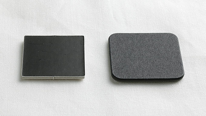
"mizu" has a solid, slightly hard feel
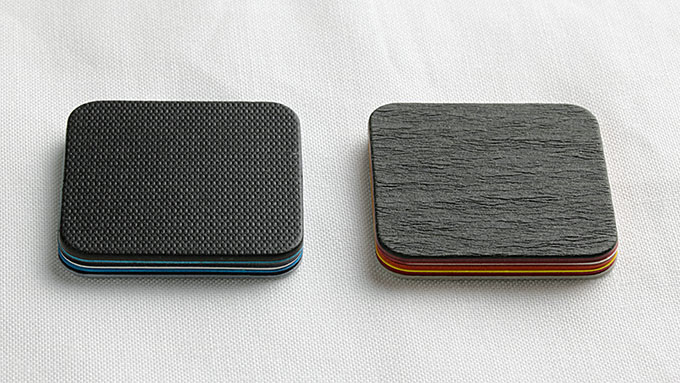
The backside of "mizu" is made of tightly pressed paper with fine embossing. The paper is called "Jacquard" and is made in Japan. It is also finished with a light varnish. The backside of "mizu" has a solid, slightly hard, firm feel in the hand, and at the same time has a pleasant "weight" that is unique to THE ART edition.
:::
:::
"hana" is the feel of soft and elegant Japanese beauty.
The back side of "hana" is made of "shindanshi" paper, the same as the box. It is beautifully embossed with Japanese "washi" like patterns, and its larger bumps than those of "mizu" contain more air, giving it a soft and elegant feel. When you experience this Japanese beauty, your temperament while playing may become more calm, gentle, and respectful. (It often feels like a tea ceremony when we play with "hana".)
:::
:::
You can imagine the difference in feel from the "sound"...
Since we cannot hold the actual product on the web, it is difficult to convey the feel and weight of the product, but we thought we might be able to convey it through sound. This video compares the sound of each version of the tile.
* The audio was recorded using an AKG condenser microphone and processed with noise reduction only, with no other effectors used or processed in any way.
:::
:::
- STANDARD edition
The tile size is the smallest, so the sound is high pitched. It is also the lightest in weight, so the volume is lower.
:::
- CLASSIC edition
The sound produced by the two-layered tiles is bright, light, and bouncy. The dry sound resonates well.
:::
:::
- THE ART edition "mizu" and "hana"
It has the heaviest, most subdued sound, with nine layers absorbing the shock and settling down pleasantly without any grating reverberations. It is not bouncy, in a good way, and feels snug and absorbent. The difference in the backside paper gives the "mizu" a harder sound and the "hana" a softer sound.
:::
Well, maybe it was a little hard to tell the difference in sound, but I hope you can see that each version is designed not only for appearance, but also for a different playing experience.
We like each version in its own way, but which one is your favorite?
:::

:::
Thank you for reading. And thank you for your support of our project.
Hiroshi MAEDA, Team Leader
:::
Bossa on Indiegogo [Ending Soon]
Late Pledge live on Indiegogo now!
The last production quota of this year.
Artisan-made versions are available in limited quantities.
https://www.indiegogo.com/projects/bossa#/
:::
Links to Bossa’s Story episodes
- 1: About Mr. Tadokoro, an amazing paper craft artisan
- 2: THE ART edition "mizu" and "hana" have a different feel!
- 3: Bossa THE ART edition, boxes are also THE ART!
- 4: THE ART edition tiles durability
- 5: CLASSIC edition in depth: Natural look and feel for everyday use
- 6: Going out with Bossa: the advantages of STANDARD edition
:::